How to Write In-App Documentation That Doesn't Interrupt the Flow


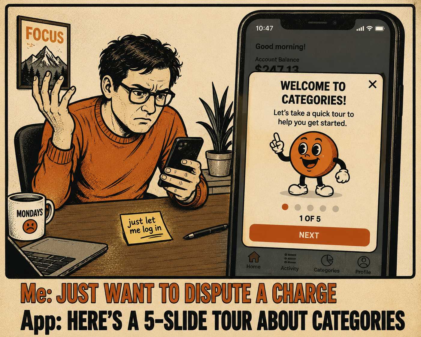
You log into your bank's mobile app to dispute a fraudulent credit card charge. You are stressed. You are in a hurry. And before you can tap a single button, the screen goes dark. A cheerful, five-slide modal appears, announcing an exciting new way to organize your spending categories.
You dismiss it instantly. You don't read a word of it. The bank built that tour to help you understand their product, but in that moment, the help was just another obstacle between you and your money.
This is the tension at the heart of in-app documentation. When done poorly, it creates friction. When done well, it reduces it. The goal of in-app help is not to provide more information. The goal is to provide information that arrives at the exact moment of uncertainty and vanishes the second it is no longer needed. This is a design problem, not a content problem.
A Tour is Not an Onboarding Strategy
Most product tours are designed like a mini-course. They force a user to click through a sequence of tooltips explaining the navigation, the terminology, and the feature highlights before the user has any context for why those things matter.
This approach treats learning as a gate. It assumes users need to study the interface before they are allowed to use it. But users do not want to study. They want to act. Research shows that people compensate for interruptions by working faster, but at the cost of higher stress and frustration. When you force a user through a tutorial, you are interrupting the very momentum that brought them to your product in the first place.
The alternative is progressive disclosure. You show users only the most critical options initially, and defer the advanced features until the user specifically asks for them.
This is how Figma handles text layout. When you open the text tool, you don't get a lecture on kerning. You get the basic formatting options. If you hover over a complex control, a small contextual tip appears. It is a layered system: inline hints for the common path, expandable details for the edge cases, and links to full documentation for the deep dives. It gives new users a safe environment to explore while giving power users the depth they require.
The Timing Problem
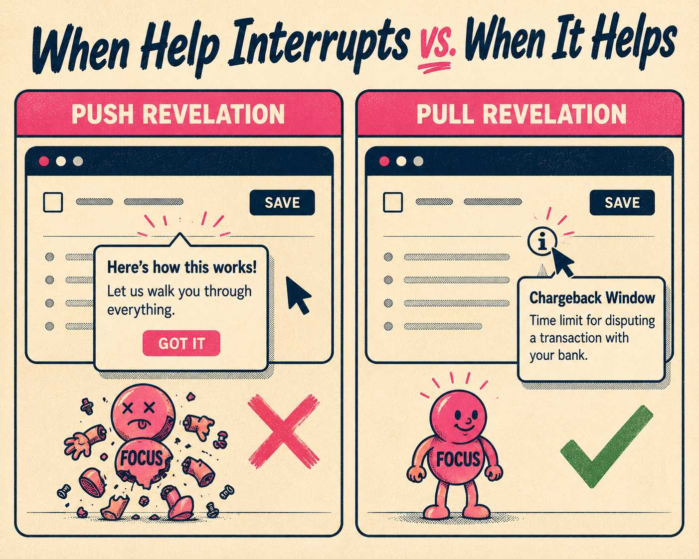
Contextual help relies on triggers. Without them, it is just noise.
You have to decide when to surface the help. A tooltip that appears on a timer, regardless of what the user is doing, is a push revelation. It pushes information onto the user when it is convenient for the system. A tooltip that appears only after a user hovers over an unfamiliar icon or fails a form validation is a pull revelation. It waits for a signal that the user actually needs assistance.
If you trigger a rescue prompt after a user hits the same error twice, that is helpful. If you trigger a feature announcement while they are mid-task, that is an interruption. And the cost of that interruption is high. It can take over twenty minutes to fully recover focus after a distraction.
You want to design help that responds to friction, rather than creating it.
When Five Words Beat Fifty
Microcopy is the language of the interface. It is the button labels, the empty states, the error messages. And it does heavy lifting.
A good button label describes the consequent state of the system, not the current one. If you are asking a user to invite their team, "Click here to invite teammates" works. "The team collaboration feature allows you to add additional users to your workspace" does not.
You have to write for action. You have to strip out the articles and the fluff. Every extra word is a tax on the user's cognitive load. If you have to write a paragraph explaining how to use a toggle, the interface is broken. The copy should guide the interaction, not apologize for it.
Where the Help Actually Lives
The placement of the help dictates how heavy it feels.
A full-screen modal steals the entire session. It demands total attention. A tooltip anchored to a specific field costs almost nothing. It respects the user's focus.
Design systems like Shopify Polaris emphasize this visual hierarchy. Help should be visible enough to find when you are stuck, but subtle enough to ignore when you are working. If you label every button with a tooltip, you create a dense, noisy interface. You have to save the contextual help for the complex workflows, not the obvious ones.
Making the Pieces Match
The terminology in your app has to match the terminology in your help center.
If your interface calls it a "Workspace" and your documentation calls it a "Team Account," you are going to lose people. Users should never feel like they have crossed a border into a different product when they click a "Learn more" link.
This consistency reduces cognitive load. It builds a predictable environment. But maintaining that consistency across different surfaces—the app, the API docs, the knowledge base—is where most teams fail.
The Numbers That Prove it Works
You can measure whether your in-app help is actually helping.
If you ship a contextual tooltip and the feature adoption rate goes up, that is a win. If the time-to-first-action decreases, the help is removing friction.
But the most telling metric is often the reduction in support tickets for specific features. If your support team is no longer answering the same basic setup question three times a day, the in-app guidance is doing its job. You have to track the hint event, the user action it targets, and the outcome. If users are dismissing the help and still failing the task, the help is either poorly written or poorly timed.
The hard part is not designing the contextual help. The hard part is keeping it accurate.
A product team shipping weekly will inevitably change the interface. They will rename parameters. They will move buttons. And the moment they do, the in-app help becomes stale. Stale help is worse than no help at all, because it actively misleads the user. Most teams do not have dedicated UX writers to audit every tooltip after every sprint.
This is an operational bottleneck. You need a system that treats documentation as a dependency of the code, not an afterthought. That is what Doc Holiday does. It generates the base layer of documentation directly from the engineering workflows—the commits, the release notes, the changelogs. It gives a content lead the structure to validate that output and ensure the terminology is consistent. You still need a human to refine the voice and deploy the guidance contextually. But the system handles the scale, so your team can focus on the flow.